


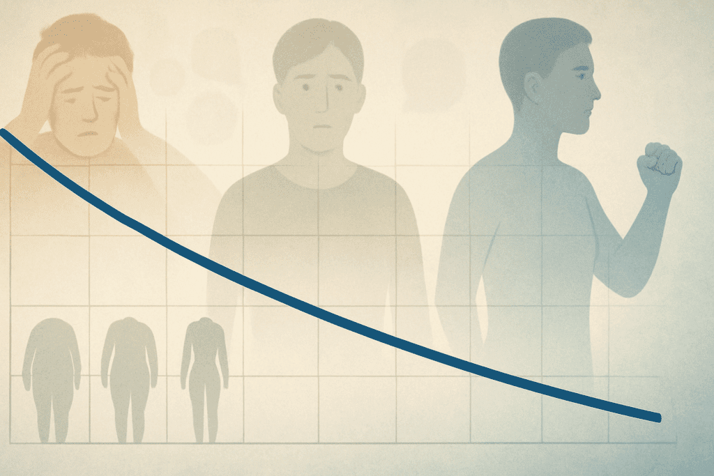
In the world of wellness and preventative health, few tools offer as much clarity and motivational power as a well-structured weight loss chart or weight loss graph. While the journey of weight reduction is deeply personal and influenced by complex biological, behavioral, and emotional factors, tracking progress with visual data can transform an abstract goal into something tangible and actionable. Whether you’re pursuing weight loss for health reasons, to improve fitness, or to manage a chronic condition like hypertension or diabetes, leveraging these tools with the guidance of healthcare professionals can significantly enhance your ability to sustain results over time.
You may also like: Expert-Backed Weight Loss Tips for a Healthier Lifestyle: What You Need to Know for Long-Term Weight Control and Wellness
Understanding the Role of Visual Tools in Weight Management
The human brain is wired to respond strongly to visual cues. This makes visual tracking methods like a weight loss graph or weight reduction chart particularly effective in motivating consistent behavior. Unlike vague notions of “getting healthier,” a chart presents progress in measurable terms. It provides a bird’s eye view of fluctuations, trends, and plateaus, all of which are natural components of the weight loss process. For many individuals, seeing gradual changes mapped over time reinforces the value of their efforts, especially when the scale itself doesn’t always reflect daily improvement.
Medical experts in behavioral weight management stress the importance of measurable tracking systems to ensure accountability. This is especially relevant in the early stages of a weight loss journey, when habit changes are fragile and motivation can waver. A weight loss chart serves as both a mirror and a map, reflecting past behavior and guiding future adjustments. Whether printed on paper, kept in a notebook, or generated by a digital app, these visuals create a continuous feedback loop that encourages incremental, sustainable progress.
How a Weight Loss Chart Improves Behavioral Insight and Consistency
A common obstacle in weight reduction efforts is the phenomenon of perceived stagnation. When the scale doesn’t budge, frustration often follows. However, by using a weight loss graph, individuals can detect underlying progress even during times when the numbers seem static. For example, pairing weight data with information on waist circumference, sleep patterns, water intake, or energy levels can reveal holistic improvements that support continued momentum.
Consistency is often what separates temporary weight reduction from lasting transformation. Recording daily or weekly metrics on a weight reduction chart helps establish routine and ritual, which are essential in building lifestyle changes. Even on days when motivation lags, the simple act of logging a number can rekindle awareness and refocus attention on long-term goals. In clinical settings, physicians and dietitians often recommend this practice as part of structured behavior therapy, particularly in medically supervised weight loss programs.
Moreover, tracking can also illuminate problematic patterns such as emotional eating, late-night snacking, or activity avoidance during high-stress periods. These trends, once visualized, can be proactively addressed. As patterns emerge on a weight loss chart, individuals often become more empowered to take corrective action with precision, rather than relying on guesswork or reactive dieting.

Choosing the Right Format: Digital Apps Versus Paper-Based Charts
In today’s health tech environment, individuals have access to a wide array of digital tools designed to simplify weight tracking. From smartphone applications with integrated fitness and nutrition databases to wearable devices that sync biometric data in real time, the possibilities are nearly endless. For those who enjoy data-rich visuals, digital weight loss graphs can offer trend lines, predictive modeling, and alerts that flag plateaus or sudden shifts.
However, paper-based charts remain popular among many wellness enthusiasts and clinical professionals. They offer a tactile experience and a sense of ownership that can be psychologically rewarding. For some, physically writing down data in a weight reduction chart creates a deeper sense of accountability. It also removes the risk of digital distractions, which can derail focus during vulnerable moments.
Ultimately, the best format is the one you’ll use consistently. If a digital interface aligns with your daily routine and helps automate parts of the process, it can enhance ease and accuracy. Conversely, if you find satisfaction in pen-to-paper rituals, a custom-designed printable weight loss chart can serve as a powerful personal wellness tool. The key lies in aligning the method with your personality, habits, and lifestyle preferences to optimize adherence.

Setting Realistic Goals Using a Weight Loss Chart
Goal-setting is a foundational aspect of effective weight loss, but it must be approached with both optimism and realism. Medical professionals recommend starting with SMART goals—those that are specific, measurable, achievable, relevant, and time-bound. A weight loss graph enables the visual representation of such goals, offering an intuitive way to mark milestones and reassess timelines.
For example, instead of targeting a vague ambition like “losing 30 pounds,” a weight reduction chart allows individuals to break that goal into manageable chunks: perhaps 1 to 2 pounds per week over several months. This segmentation not only boosts morale as small victories accumulate but also makes it easier to detect when progress stalls. By comparing actual results with target projections on a weight loss chart, necessary adjustments in diet, activity, or rest can be made with evidence-based clarity.
Another crucial benefit of goal-tracking with graphs is the ability to distinguish short-term fluctuations from long-term trends. Weight can vary significantly due to hydration, hormonal changes, or digestive shifts. A weight loss graph helps place those temporary deviations in context, preventing overreaction or discouragement. This nuanced understanding fosters emotional resilience and a deeper commitment to the process.
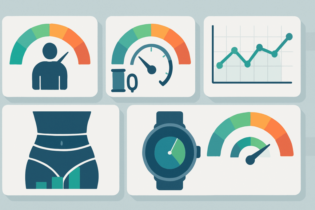
Incorporating Health Metrics Beyond Weight
While the number on the scale is often the focal point, true health improvement involves a broader spectrum of markers. A comprehensive weight loss chart can include additional metrics such as body mass index (BMI), body fat percentage, blood pressure, and even lab values like cholesterol or blood glucose levels. These indicators offer a richer understanding of physiological change and may reveal benefits of weight reduction even before visible weight loss occurs.
For instance, someone may experience a significant drop in systolic blood pressure or fasting insulin levels after just a few weeks of dietary change and exercise. Capturing this progress on a multifactorial weight loss graph allows for a more holistic view of success. It also reinforces the idea that weight reduction is not just about aesthetics, but about reducing disease risk and enhancing quality of life.
Physicians often emphasize this broader perspective during consultations, helping patients reframe their goals in health-centric terms. When integrated with medical monitoring, a weight reduction chart becomes not just a motivational tool, but a valuable clinical resource that can guide treatment decisions and risk management strategies.

Using a Weight Loss Graph to Navigate Plateaus
Weight loss plateaus are almost inevitable in any sustained reduction effort. Rather than signaling failure, these periods often reflect the body’s adaptation to a new baseline. Tracking trends on a weight loss graph can help interpret these plateaus as part of a natural progression rather than a cause for alarm. By examining the slope of change over weeks or months, users can identify when a plateau is a short-term stabilization versus a prolonged stall that may require intervention.
In cases where the plateau persists, a detailed weight reduction chart can offer clues. Is there a concurrent drop in physical activity? Has sleep quality declined? Are stress levels higher than usual? These correlated variables, when noted alongside weight data, can inform more precise adjustments. In fact, many dietitians use these charts to fine-tune macronutrient intake, caloric thresholds, or workout routines based on visible feedback.
Furthermore, visual graphs can help reframe success during plateaus by highlighting non-weight-related improvements such as increased lean muscle mass or improved cardiovascular endurance. By viewing the data holistically, individuals are less likely to abandon their efforts and more likely to adopt a sustainable approach that respects the body’s biological rhythms.
Psychological Benefits of Seeing Progress on Paper or Screen
Psychologically, the act of seeing progress—even modest changes—can generate a strong emotional reward. This concept, known as “visual feedback reinforcement,” is supported by research in behavioral science and cognitive psychology. A steady upward or downward trajectory on a weight loss chart delivers validation, builds confidence, and enhances self-efficacy, all of which are critical to long-term success.
This visual reinforcement can be especially meaningful for those who have struggled with yo-yo dieting or body image concerns. A weight loss graph does not judge—it simply records data. Over time, this neutral, fact-based feedback can help replace self-critical narratives with objective observation. It also creates opportunities for self-compassion, allowing users to celebrate small gains and maintain emotional equilibrium during setbacks.
In therapeutic contexts, counselors and health coaches often recommend journaling alongside chart tracking. This dual approach fosters introspection and emotional processing, making the journey toward weight reduction a more integrated experience. The chart offers structure; the journal provides space for story. Together, they support both the physical and psychological dimensions of well-being.

Doctor-Recommended Tips for Creating an Effective Weight Reduction Chart
Healthcare professionals offer several best practices for those looking to incorporate a weight reduction chart into their wellness plan. First and foremost is consistency. Data should be logged at the same time of day, under similar conditions, ideally first thing in the morning after using the restroom and before eating. This reduces variability and enhances the accuracy of trend analysis.
Next, keep the chart simple but comprehensive. Track not only weight but also relevant lifestyle variables like calorie intake, hydration, hours of sleep, and minutes of physical activity. These elements create a more detailed narrative and help connect behavior to outcome. Additionally, avoid the temptation to record data multiple times a day. This can fuel anxiety and detract from the broader perspective needed for sustainable change.
Privacy is also important. Whether digital or physical, your chart should be stored in a location where you feel secure and uninhibited about recording honest data. Sharing your progress with a healthcare provider or accountability partner can be helpful, but make sure this support system fosters encouragement, not judgment. Finally, set review intervals—weekly or bi-weekly—to evaluate trends, celebrate wins, and adjust strategy with purpose.
Integrating the Chart into a Broader Wellness Plan
A weight loss chart should not exist in isolation. For it to truly support safe and sustainable results, it must be part of a broader lifestyle framework that includes balanced nutrition, regular exercise, emotional resilience, and medical oversight. The chart is a reflection of these efforts, not a substitute for them. Think of it as a compass, not a destination.
Dietitians and physicians often integrate chart tracking into multidisciplinary care plans, especially for individuals with underlying health conditions. For instance, patients with Type 2 diabetes may use the chart to monitor how dietary changes affect glucose control. Those with high cholesterol may correlate weight reduction with lipid panel improvements. This evidence-based approach enhances patient engagement and fosters informed decision-making.
Moreover, a weight reduction chart can help identify when professional intervention is needed. If despite consistent efforts the data shows stagnation or regression, it may signal the need for a deeper assessment of metabolic function, hormonal balance, or psychological factors. In this way, the chart acts as an early detection system for obstacles that may otherwise go unnoticed.
A Balanced Perspective on Numbers and Non-Scale Victories
While the numerical data on a weight loss graph is valuable, it’s important not to let it eclipse other forms of progress. Improved energy levels, better sleep, enhanced mobility, and elevated mood are all meaningful indicators of success. These non-scale victories (NSVs) often precede measurable weight changes and should be tracked, noted, and celebrated.
Incorporating a section for NSVs in your weight loss chart reinforces the idea that health is multi-dimensional. It also protects against the tunnel vision that can occur when the scale becomes the sole focus. In clinical psychology, this approach is often used to promote intrinsic motivation—the kind that sustains effort over the long haul. When paired with quantitative data, qualitative achievements help complete the picture of a truly successful transformation.
Frequently Asked Questions (FAQ): Using a Weight Loss Chart or Graph for Sustainable Progress
1. How can a weight loss chart help when progress feels invisible? A weight loss chart offers more than just numbers—it reveals subtle shifts and long-term patterns that a scale alone cannot show. When daily weight changes are minimal or erratic due to normal physiological fluctuations, a chart helps you focus on broader trends. For example, plotting data over several weeks on a weight loss graph may show a gradual downward slope, even when the day-to-day readings fluctuate. This perspective is particularly useful during periods of perceived stagnation, as it reduces discouragement and keeps you focused on the long game. Incorporating qualitative notes, such as energy levels or appetite changes, alongside numerical values on your weight reduction chart can further deepen your understanding of progress.
2. Can a weight loss graph be used to manage weight-related chronic conditions? Absolutely. For individuals managing conditions like Type 2 diabetes, hypertension, or metabolic syndrome, a weight loss graph can function as a valuable adjunct to clinical care. Tracking weight reduction consistently enables both patients and providers to observe correlations between lifestyle interventions and physiological responses. For instance, a physician may review a patient’s weight reduction chart alongside blood pressure logs to evaluate how dietary changes are impacting cardiovascular health. These insights can prompt earlier interventions or modifications to treatment plans, making the weight loss chart an integral part of personalized chronic disease management. Moreover, the visual nature of the data facilitates shared decision-making and improves patient engagement.
3. How does emotional well-being relate to maintaining a weight reduction chart? The relationship between emotional health and weight tracking is nuanced but significant. A well-maintained weight reduction chart can foster feelings of agency, clarity, and self-discipline. However, if approached obsessively or used as a tool for self-criticism, it can contribute to anxiety or disordered thinking. To counter this, mental health professionals recommend setting intentions for using a weight loss graph in a supportive and self-compassionate way. Rather than fixating solely on weight, the chart can include emotional check-ins, gratitude reflections, or notes on personal wins unrelated to the scale. This broader context transforms the chart into a wellness log rather than a metric of self-worth.
4. Are there innovative ways to customize a weight loss chart beyond body weight? Yes, today’s tools allow for highly personalized tracking that goes beyond simple weight measurements. Many individuals now incorporate fields for muscle mass, hydration status, daily stress levels, and even menstrual cycle tracking into their weight loss chart. These data points create a fuller picture of how the body is responding to different conditions. Some users integrate wearable tech that automatically updates a weight loss graph with real-time data from activity levels and sleep patterns. These advanced features provide a more complete narrative and make it easier to adjust fitness or dietary plans with precision. By expanding what you measure, your weight reduction chart becomes a dynamic reflection of your health ecosystem.
5. How can families or partners use a weight loss graph collaboratively? Shared tracking can be a powerful tool when approached with mutual respect and support. Couples or family members aiming for healthier lifestyles might co-create a shared weight loss chart, where progress is logged side-by-side. This shared experience can foster accountability, camaraderie, and even a sense of friendly competition. However, it is essential to maintain healthy boundaries and avoid judgmental comparisons. Using a collaborative weight loss graph also allows partners to synchronize goals, meal plans, or exercise routines, creating a team-oriented approach to weight reduction. When done with empathy, it can strengthen relationships while reinforcing long-term health behaviors.
6. What role can a weight reduction chart play in preventing weight regain after success? Maintenance is often the most challenging phase of any weight loss journey. A weight reduction chart becomes especially useful here by providing early warning signs of creeping regain. By continuing to log weekly data even after reaching a goal, individuals can spot upward trends before they become difficult to reverse. Unlike reactive dieting, this proactive monitoring empowers users to make small, timely adjustments to diet or activity. Some users even adapt their weight loss graph into a maintenance graph, adjusting the target zone and using color coding to reflect ideal versus cautionary weight ranges. This form of visualization acts like a gentle accountability partner for long-term success.
7. How do professionals recommend adjusting a chart during lifestyle transitions? Major life changes—such as pregnancy, aging, job shifts, or injury recovery—often require a revised approach to tracking. Health professionals suggest recalibrating your weight loss chart to reflect new realities and expectations. During such transitions, you might switch from a focus on weight reduction to maintenance, strength gains, or even stress management. For example, after recovering from surgery, your weight loss graph could prioritize mobility milestones or pain levels alongside body weight. Adapting the chart ensures it remains relevant and encouraging, rather than becoming a source of pressure or disappointment. Flexibility in your tracking approach fosters resilience and lifelong engagement with your health.
8. Can a weight loss chart be integrated into therapeutic or coaching sessions? Yes, many licensed therapists, health coaches, and registered dietitians now include visual tracking tools like a weight loss graph as part of their practice. When used collaboratively, the chart becomes a shared reference point during sessions, helping both the client and the practitioner understand trends, setbacks, and breakthroughs. This evidence-based approach shifts the conversation from subjective feelings to observable data, allowing for more grounded and constructive dialogue. Coaches may use the weight reduction chart to celebrate milestones or to troubleshoot obstacles with greater specificity. As the field of integrative health grows, combining data-driven tools with psychological support is becoming an increasingly standard and effective model.
9. What emerging trends are shaping the future of weight loss graph technology? As digital health evolves, we’re seeing innovations in AI-driven analysis, real-time biofeedback, and gamification applied to the weight loss graph experience. New platforms can now offer predictive modeling, alerting users when they’re veering off track based on subtle changes in habits or input data. Additionally, some apps use machine learning to suggest personalized interventions, such as increasing protein intake or adjusting sleep schedules, based on a user’s weight reduction chart. Virtual reality (VR) and augmented reality (AR) are also starting to be explored as immersive tools that visualize health data in 3D, enhancing user engagement. These advances aim to transform passive tracking into an interactive and adaptive wellness experience.
10. How do cultural and social factors influence the use of weight reduction charts? Culture plays a significant role in how individuals approach weight tracking and interpretation of success. In some communities, discussing weight loss openly may be stigmatized or emotionally charged, making the private use of a weight reduction chart a safer alternative. Conversely, in cultures where community health is emphasized, shared tracking and group goals using a communal weight loss graph can be empowering. Language, education, and access to technology also affect how easily someone can use and interpret these tools. It’s important to recognize that no single model fits all—a culturally sensitive approach ensures that a weight loss chart serves its intended purpose without triggering shame or alienation. Customization and context-awareness are crucial for inclusive, effective use.
Final Reflections: Using a Weight Loss Chart or Graph for Sustainable and Empowered Health
As health professionals and behavioral scientists increasingly emphasize sustainable approaches to wellness, the value of a weight loss chart or weight loss graph continues to grow. These tools offer far more than just visual representations of numbers; they function as vehicles of self-awareness, behavioral insight, and emotional reinforcement. When used thoughtfully and consistently, a weight reduction chart becomes a dynamic ally in the pursuit of lasting health.
Tracking progress in this way allows for a nuanced understanding of the body’s response to lifestyle changes, and it encourages persistence even when visible results take time to appear. By embedding this practice within a broader wellness strategy—one that honors both physiological and psychological needs—individuals can approach weight reduction with greater clarity, compassion, and resilience.
In the end, the chart is more than just a record of what has been lost; it’s a testament to what has been gained: discipline, knowledge, confidence, and a deeper relationship with one’s own health journey. For those seeking not just temporary weight loss but sustainable transformation, a weight loss graph or weight reduction chart is not just helpful—it is essential.
Further Reading:
10 tips for successful weight loss